I like to live photography interwoven with other disciplines in a sort of a great artistic connection. So, I try to approach the photo composition and techniques thinking of examples, sometimes forcing my memories, in the most heterogeneous disciplines and without a pure formal method. I find this way more versatile and, above all, feeds mind with different inputs.
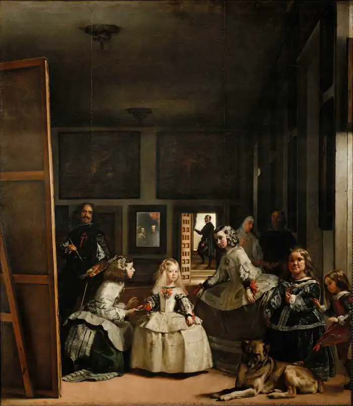
That’s why it has always impressed me the Vélazquez painting Las Meninas (1656, today in the Prado Museum). This is one of Velázquez`s largest piece and among those in which he made most effort to convey a sense of life and reality while enclosing a dense network of meanings.
The artist divides the scene in a sort of cinematographic shot ante litteram, defining the foreground, middle ground and background and the depth of field recalls a wide lens.
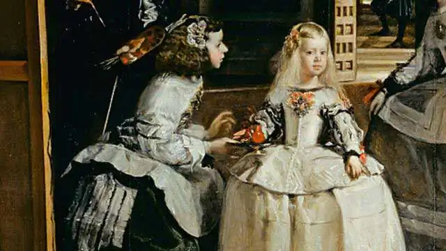
The composition is attentive to focus the attention on the young girl, the Infanta Margarita daughter of the Spanish King Filippo IV and the Queen Mariana, in the background blurry reflected in the mirror. A powerful symbol used particularly in Fine Arts or surreal images, like in the ones of Francesca Woodman.
Margarita, the focal point, is illuminated as she faces towards the main light source on the right-hand side of the painting, like in a sort of contemporary studio shooting, whereas most of the other figures are facing away from the light.
The sophisticated scene follows the rule of thirds and the construction of the golden section, at the foundation of the idea of balanced beauty borrowed from nature and firstly approached by Plato in the Republic dialogue. Both of them are currently used in the photography framing.
Velázquez boldly included himself in the painting on the far left-hand side, standing brush-in-hand in front of a large canvas. It reminds me of many images taken in the history of photography such as the modern selfies too.
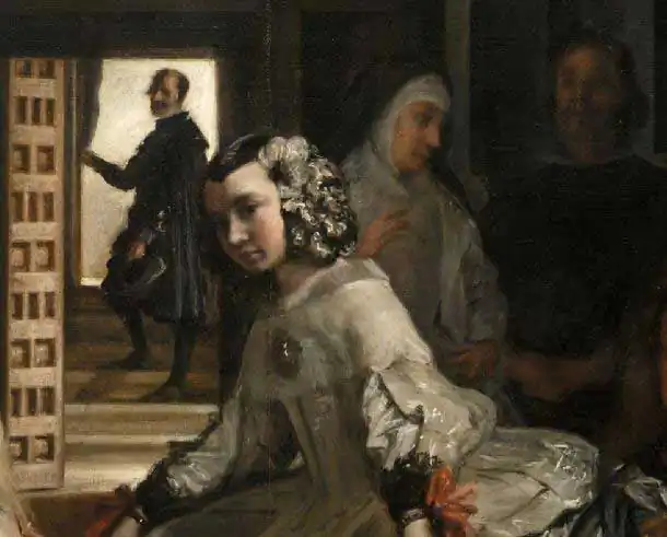
In the background, you can see a man in the open doorway, coming or going and in isolation. He is dark and the background is lit up in order to create a clever and subtle point of contrast (photographers, you know what we are dealing with, don’t you?).
This painting features several frames: the room in which they are all standing, the paintings on the wall, the painting Velázquez is working on, the mirror and the door in the background. You get a feel of structure and organization but in a dynamic way, like in a Cartier Bresson’s photo.
Then you have other interesting, organic shapes created by the people and dog creating a pleasant contrast between rigid and organic; straight and curved; stillness and movement.
All in all, it is surprising how this baroque painting, that inspired also Picasso and Dalì, is full of prompts and suggestions for the photographers still today. A good lesson to take the arts evocative energy back and alive in our practice.


