We discussed with the wonderful photographer Jeanette May all her clever photo narratives, her relationship with technology, and the feelings and emotions involved. She revealed the metaphors and meanings behind the inner and exterior designs of the technological gadgets she shoots for her series.
She also told us about her inspiration, process of work, ideas, evolution in her series, and her aesthetic decisions. In this interview, she gave us some clues about her tricks to depict conceptually serious topics. Jeanette transforms the dangers of technology into tenderness, innocence, and charm, only she could achieve this! Keep on reading to learn how. [Offcicial Website]
Your project Curious Devices produces a sensation of tenderness through the dazzling display and presentation of obsolete technological devices. There is also a weird sense of safety and harmlessness like if these machines would lose any possible negativity or danger implied in them when some years passed by. This is one of the achievements of this series to transform technology into innocence. Your series Tech Vanitas seems to be the first step to getting to Curious Devices , from the plain and black background, it evolved into complex and beautiful patterns used as the stage. Every still life shows the world as a stage with its different lamps lighting the objects, each of them also showing personality as they belonged to different families or homes. How was the transition from one series to the other? What’s your relationship with technology? What emotions were you looking for to transmit with these modern still lives?
My relationship with technology is filled with anxiety. I worry about keeping up with new technology. I try to avoid adding to landfills by trashing broken or obsolete tech gadgets. So, I keep tech too long, recycle or fix it when possible, and display beautiful relics! I intended to convey my anxiety, love, and nostalgia for these objects.
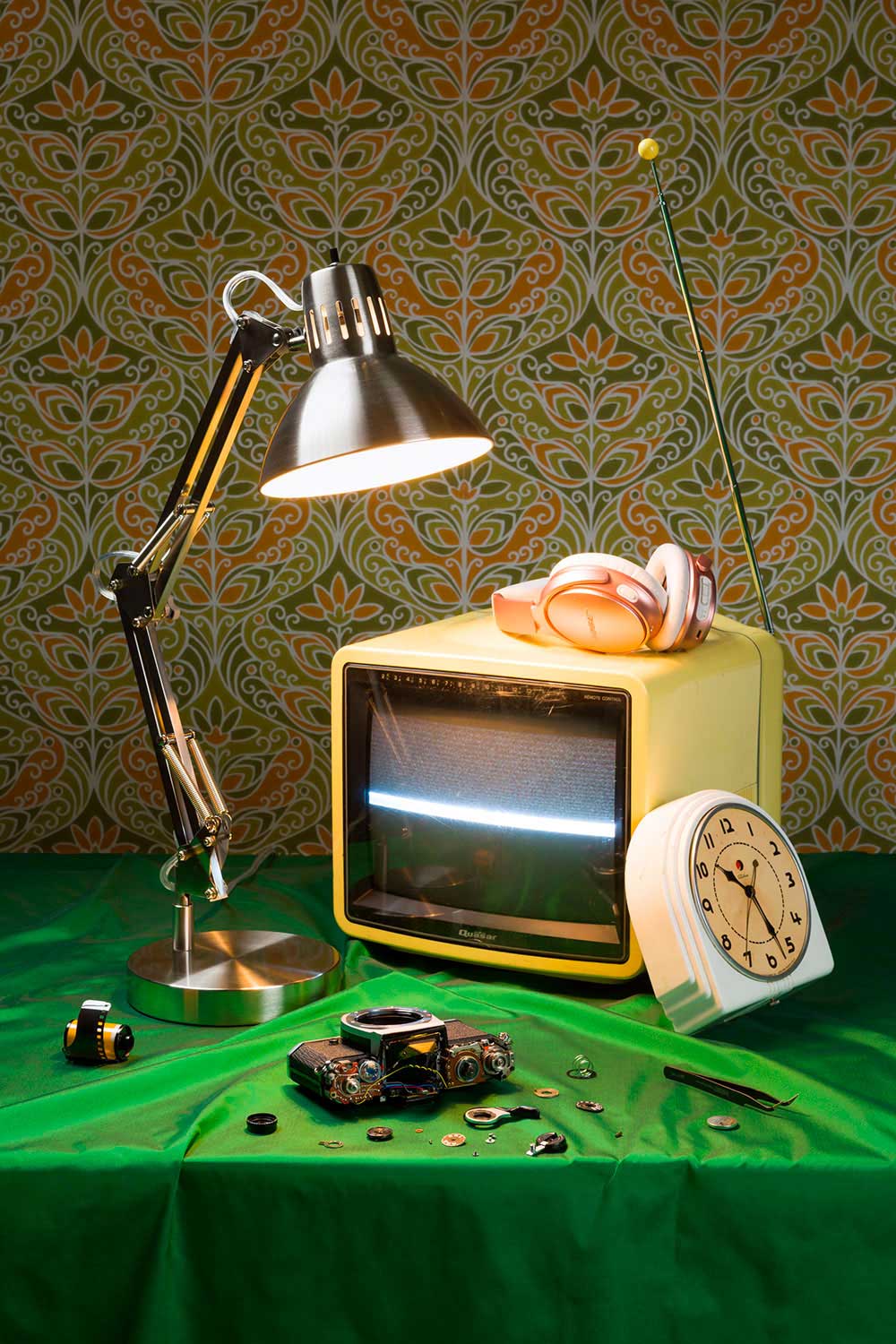
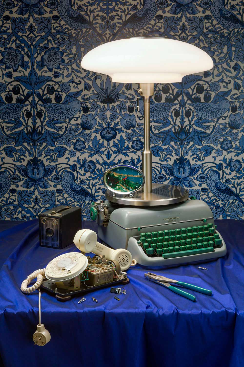
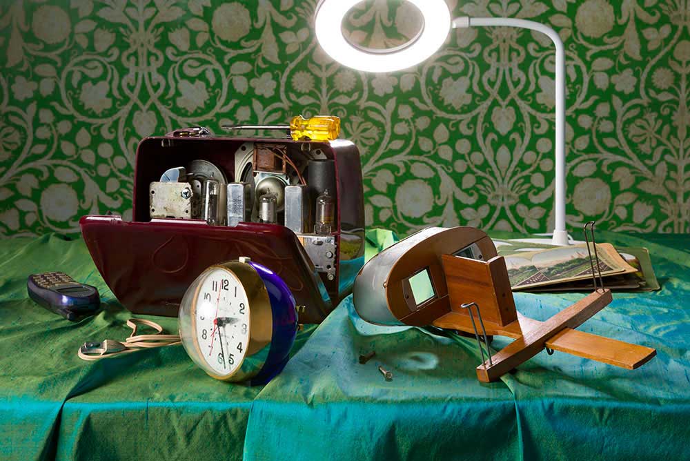
From the start of the Tech Vanitas series, I planned to open some of the tech items to reveal the inner workings. However, I was too enamored of the exterior designs. Later, I decided that showing the broken, or working, aspect of the technology was important to my concept. Each still life in the Curious Devices series includes a visibly broken piece of tech, or the gears, circuit boards, and inner workings.
Tech items often lack color and I love color. Tech Vanitas has colorful, patterned fabrics on the table and dark backgrounds to add a painterly, 17 th Century Dutch reference. For Curious Devices, I switched to damask-patterned wallpapers and solid-colored silk fabrics on the tables. The effect is even more lush and elegant than my earlier still lifes.
Fertility in the Age of A.R.T. , which is one of your most thoughtful and insightful series, looks like photos from a catalog, almost like an advertisement or leaflets concerning form. The texts used also add a conceptual and philosophical approach, converting this series into a conceptual work of art. There is much creativity in your process of work, especially in the connections you create in the images throughout all your works. How do you find these relations? How do you join images together to make a statement? Tell me about your planning and work process. How do you manage to balance criticism and humor in your series?
I was very interested in the political and cultural aspects of women’s fertility when I created the Fertility in the Age of A.R.T. series. I did a lot of research and used some of it directly in the text printed on each triptych. I produced all the photographic images (except the sonogram and the bull) as I considered each topic: birth control, sperm banks, maternal age, reproductive rights, etc. By combining three images and two quoted texts, I hoped the viewer would find the relationship between each and expand their understanding of these complex issues. I believe beauty and humor can entice viewers to consider serious topics.
Your work Flora & Fauna deals with animals and places in a genius manner. You have played hide and seek with the animals and found them a place to be, again using irony and critique, however, the display is candid and the twists make viewers smile and think at the same time. How do you remember this series? Which was the motivation key for these images? How do you usually find inspiration for a series?
I was living in a lovely residential area outside of Washington, DC. I became interested in how people structured their little plots of nature. Organized planting is not new, but I was amused by the desire to create a “natural” look. My research was less intense than the Fertility series. For Flora & Fauna, I explored the front yards of my neighbors, from the safe distance of the sidewalk, and read books and magazines on garden design. The current gardening trend was to create a highly structured natural look and to attract certain wild creatures (birds and butterflies). The book texts were all very similar, and I found the writing humorous: For an air of mystery and discovery, conceal parts of the garden; place a bubbling fountain around a bend in a path, so that visitors search for the sound.
In Bachelor Pads and Easy on the Eyes , we find again a catalog to choose a man. There is a sense of availability in them, almost as products. They look like profile photos from the applications to find a partner, both series show solitude, maleness, and beauty. While in the bachelor one, there is some calmness, this relaxation is disturbed in Easy on the Eye by the mysterious presence of female accessories and objects. Once the eye spots them, we start making questions about the narrative. It makes us wonder where the women of their lives are. How is your work with models and people? Do you share with them your conceptual intentions? How was working with these men for these two series?
I’m a feminist artist and had created earlier projects exploring women and sexuality. I realized that US culture offered women few images of men as objects of desire. Yes, there are many examples of beautiful men for male viewers and some earlier attempts by women artists, but the genre was still lacking. So, I created the Easy on the Eyes series as cinematic photographs of beautiful men and an “implied women.” I hoped the implied woman would clearly signify that women are the intended audience for these photographs. Each image includes a text panel. The text is from a novel written by a female author. The image does not illustrate the text, although the female protagonist quoted is contemplating a desirable man.
I found my models by starting with friends, neighbors, and college students, then I approached men at restaurants, movie theaters, etc. None of them were professional models, although I did hire life-drawing models for the nudes. I was always clear about my intentions for the photographs. I also give my models “veto power.” I select my preferred images from the photo session and then allow the model to “veto,” or reject, any of my selections. I don’t want the men pictured to be uncomfortable with the final image. All the men were great to work with in both projects. The only difficulty was finding locations for the Easy on the Eyes photos, and scheduling.
The series Morbidity & Mortality deals with life and death through the playful display of crime scenes. The cuddly toys staged in death scenes become pop art. There is joy in these horror or film noir tales. Nostalgia and childhood are also concepts shown in the series. The danger is depicted candidly, losing its dark side. How was the creative process for this series? How did you find the settings and the toys displayed in this work?
The Morbidity & Mortality photographs are also cinematic in style as I was referencing the oddly beautiful presentation of dead bodies in contemporary film and television. I used pet toys (toys for dogs and cats) as my “models” because they are designed to be murdered by your pet. I spent too much time in pet stores looking for toys that were a bit creepy. I looked for locations appropriate to a stereotypical murder scene: dark alley, stairwell, rocky shoreline, deep snow, etc.
How do you combine your presence in galleries, your work in the studio, and your social networks? Could you tell me about a day in your life?
I am always juggling. As I work on this interview, I am also posting images on social media and preparing photographs for an exhibition opening soon. I wish that I was better organized and found more time to make photographs. I set goals and deadlines for myself, which helps.
Thanks, Jeanette for your time and dedication to this interview, it’s been a great pleasure to know more about your priorities for content and form in your photography production. And thanks for your work, it made me enjoy and think at the same time!
Seigar
Seigar is a passionate travel, street, social-documentary, conceptual, and pop visual artist based in Tenerife, Spain. He feels obsessed with the pop culture that he shows in his works. He has explored photography, video art, writing, and collage. He writes for some media. His main inspirations are traveling and people. His aim as an artist is to tell tales with his camera, creating a continuous storyline from his trips and encounters. He is a philologist and works as a secondary school teacher. He is a self-taught visual artist, though he has done a two years course in advanced photography and one in cinema and television. His most ambitious projects so far are his Plastic People and Tales of a City. He has participated in several international exhibitions, festivals, and cultural events. His works have been featured in numerous publications worldwide. His last interests are documenting identity and spreading the message of the Latin phrase: Carpe Diem. Recently, he received the Rafael Ramos García International Photography Award. He shares art and culture in his blog: Pop Sonality.


