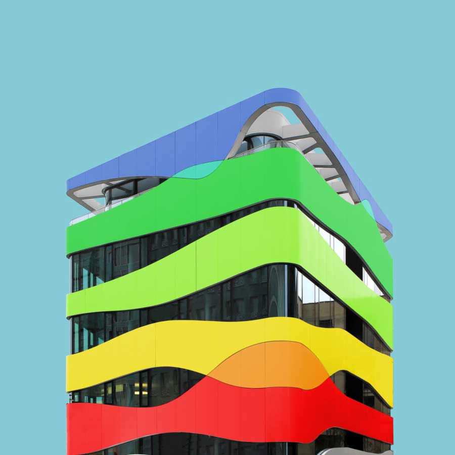
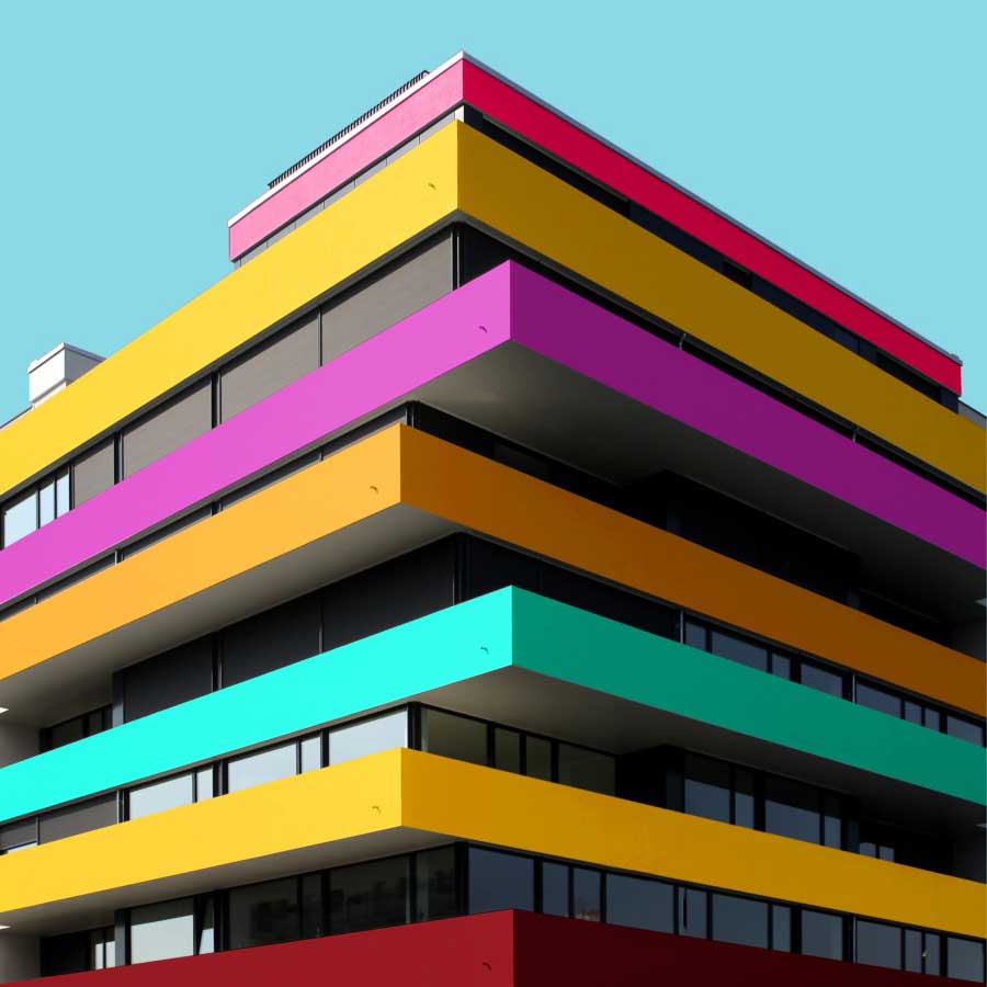
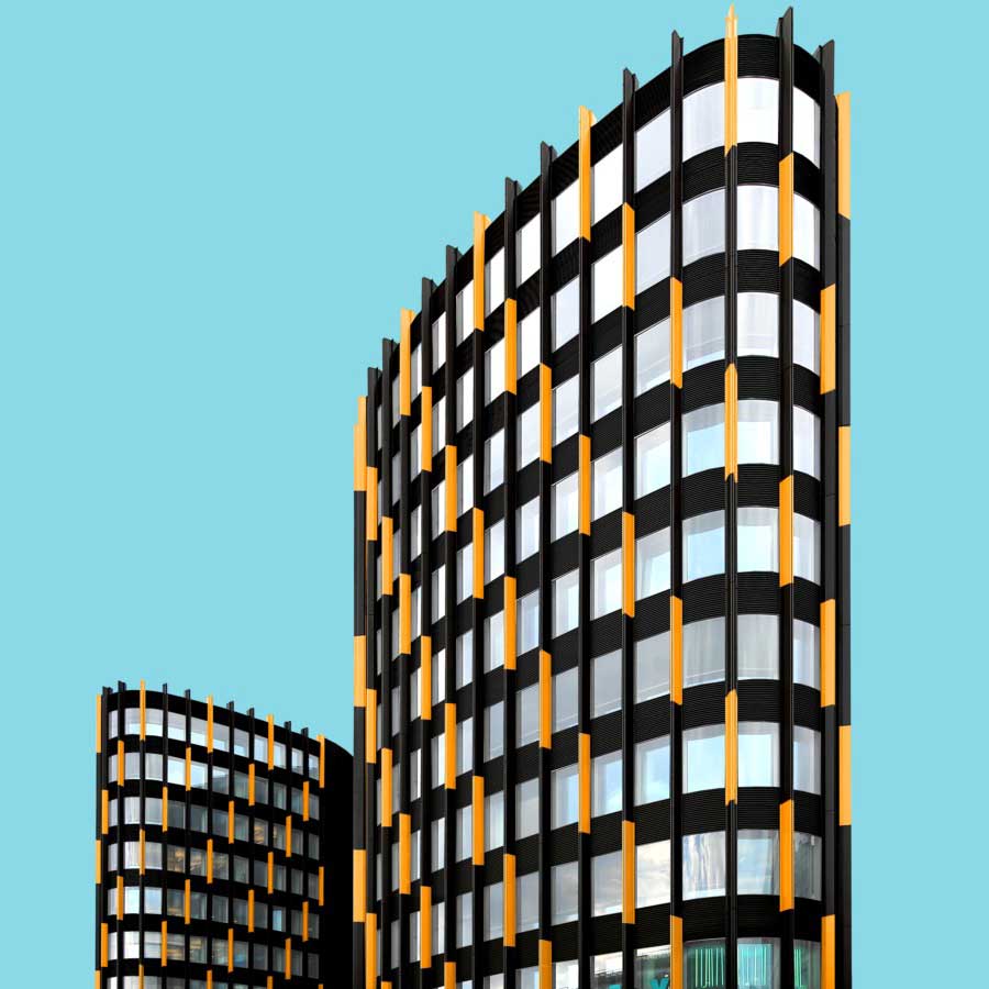
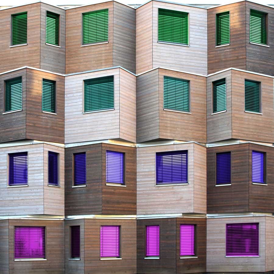
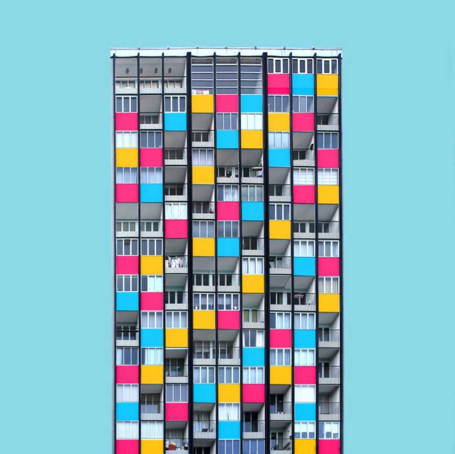
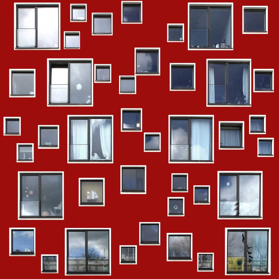
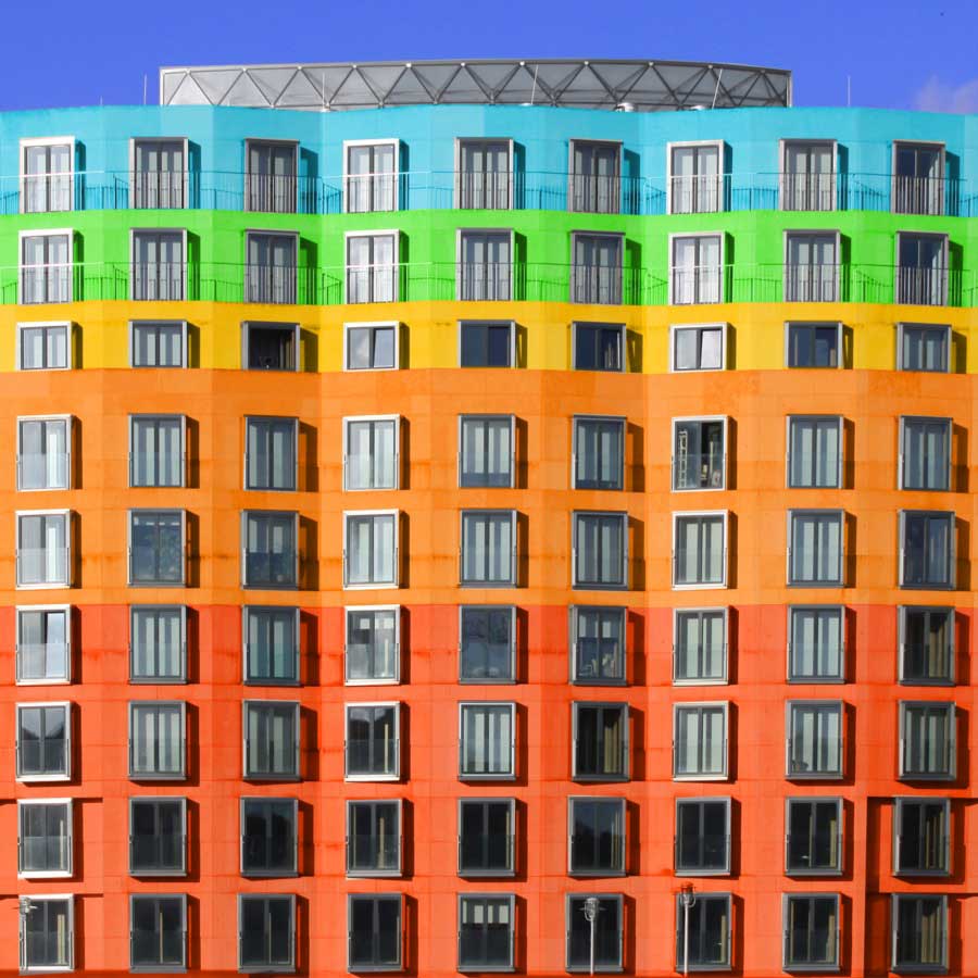
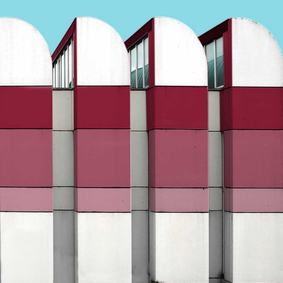
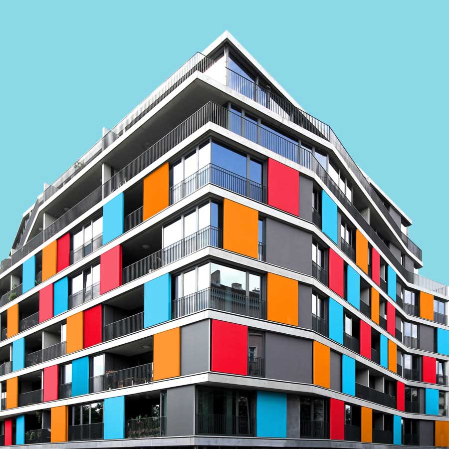
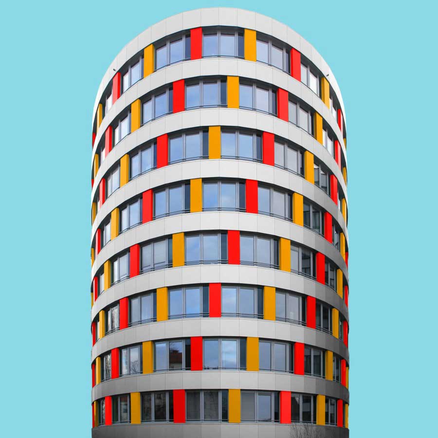
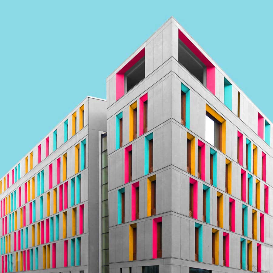
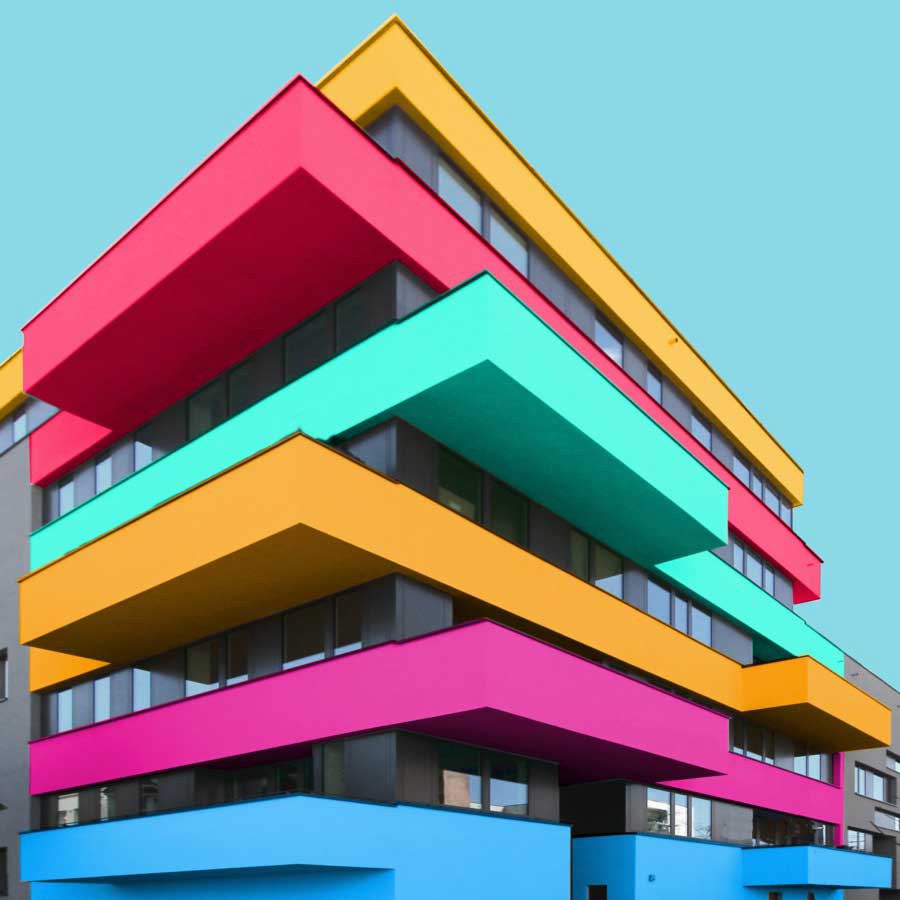
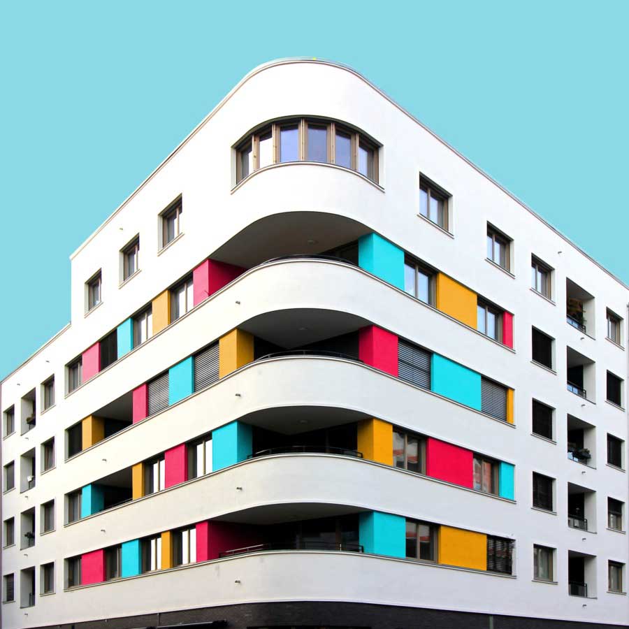
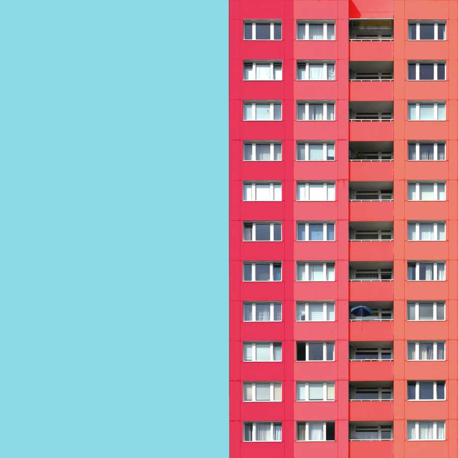
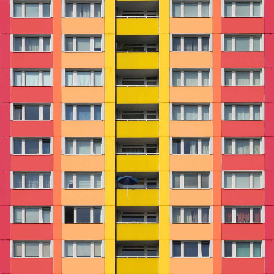
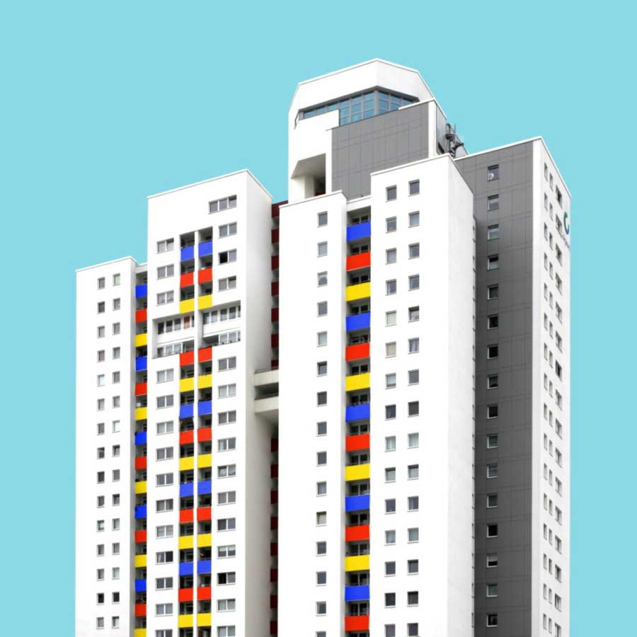
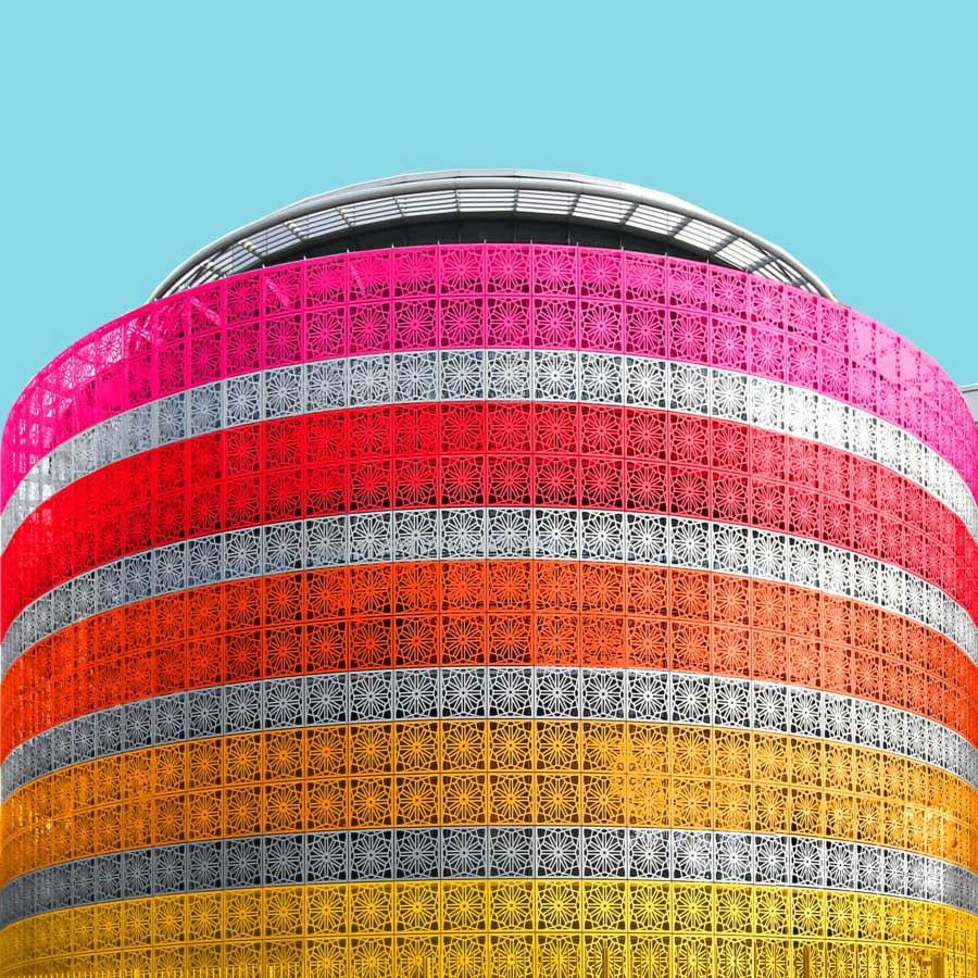
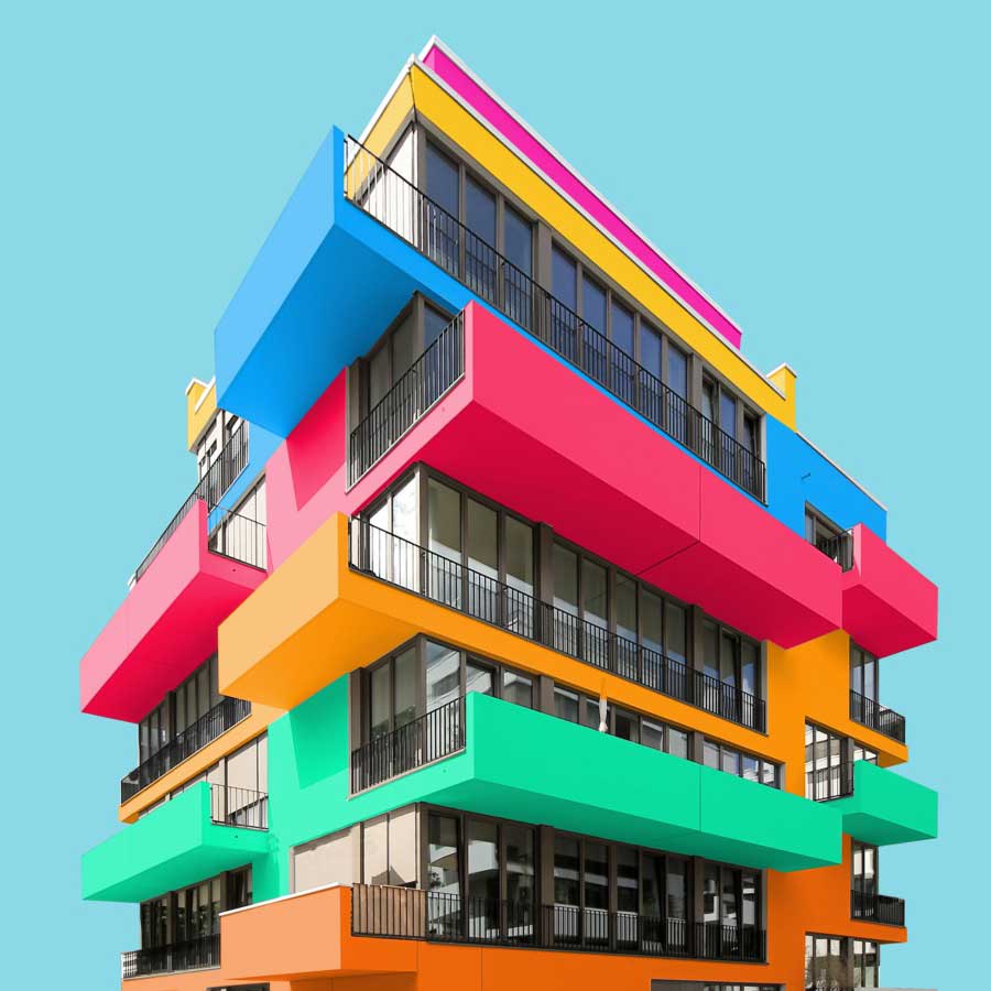
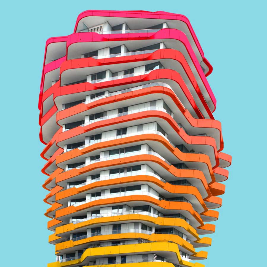
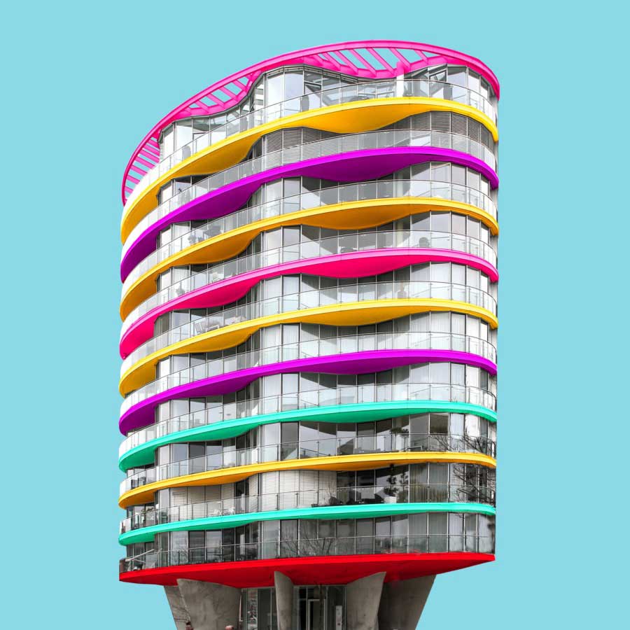
In Paul Eis’ Instagram project, he gathers images of buildings from mainly Berlin, Hamburg and some other cities, which are cut of their original context and reworked with bright colors.
His project shall show that architecture can be more than just creating something useful but also art. He started his project one year ago in the summer of 2015. Cause of his passion for architecture, he also did some “classical” architecture photography before. But at one day in that summer he just watched at the photos he took the last day and was wondering why the buildings are all that gray.
So he just thought how each building would look like when they are not white or gray but have bright colors. Then he just decided to do exactly what he thought. He started to give the buildings a new look with the computer and a lot of bright colors. The first buildings he worked on had been the typical socialist housing estates in east Berlin, which are characterized by a very clean and continuous repeating geometry with strong rectangular shapes and also by its monotonous shades of white or dirty gray. His first colored images had been only straight facades, then started to add whole buildings to the series.
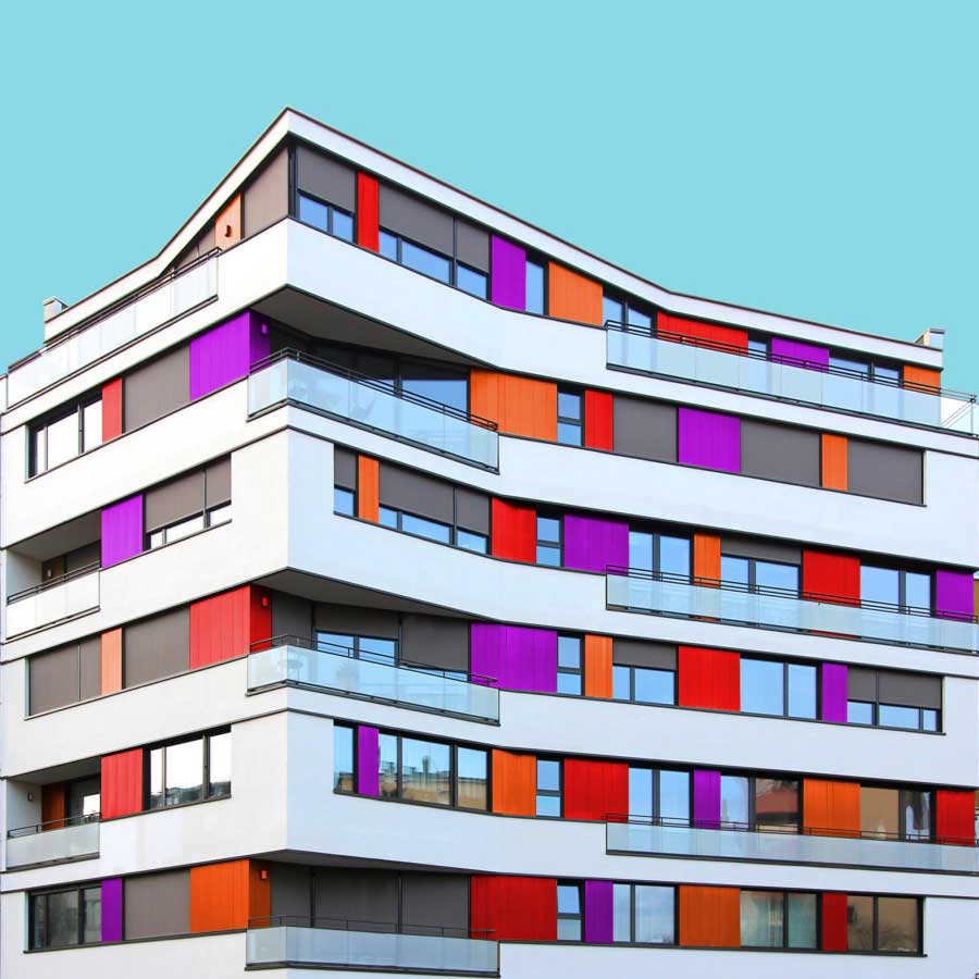
All the images have the same uniform blue background which acts as one of the characteristic elements of the series besides the colors. It focuses the viewers eye on the building itself and gives a good contrast to colored and the white areas of the buildings. When coloring the buildings he orientates on the structure of the buildings facade. For example elements like balconies, windows or other elements of the facade. His color palette includes colors which are rich of contrast to each other or colors which are defining a gradient. He takes the photos mainly with a wide angle lens and applies a perspective correction in the edit. So the vertical lines of the building are vertical in the image. That gives the images a sense of depth but also let the building seem somehow stoic. Then he cutes the buildings literally out of their environment which and adds the blue background. That gives the buildings a minimalistic look and reduces the content of the image in the colored building itself. With that he wants to show that the buildings do not have to be a structure which has to fit in any environment but also a piece of art which can also stand for itself. But in the reality also the buildings which are more interesting in its structure got ingested with their grayness by the boring cityscape. Coloring those buildings shall help the viewer to understand the artistic demanding modern architecture has or should have. Paul Eis understands his project as a critique on the contemporary architecture. Not in the lots of interesting in creative buildings which got developed but more on the often very uniformly luxury housing estates. These buildings mostly are build in a style of “neoclassicism”. And that trend of developing houses in that, for him very boring, style of architecture can be found in whole Germany and also in cities of other countries. For him it’s not understandable why a lot of people are buying those houses for that high prices. But that is probably because many people are not interested in architecture or a interesting cityscape. And even if the representative buildings like museums or universities are getting a more and more individual designs, many people wants to live in uniformly and, even if these are comfortable to live in, very boring houses. Paul Eis wants the people to think more about individual and interesting architecture.
Paul Eis is 18 years old and was born in Berlin. He finished school this year and starts now studying architecture in Linz, Austria.
