Every person you ask might have a different answer to that question, however, from my experience, there are a few key factors that are imperative to transforming a just good image to a great one.
It was and always will be my belief that a great architectural image must adhere to the following 3 features:
- Composition is King. In architectural photography, you need to see in the language of geometric lines and shapes. These elements must create a harmonious balance within your frame. Without this component, not much can be done to salvage an image.
- Once the shot is made, it is important to ask yourself, what elements in the image are not adding to the story you wish to tell. In other words, this means Simplifying your scene by eliminating unnecessary details.
- Once two factors above are covered, the work on post processing begins. If you are familiar with my work, are must be aware by now that I am a strong advocate of ‘creating’ an image and not ‘capturing’ one. This means to accentuate and exaggerate the compositional elements discussed in point 1. To create depth, volume and balance through selective lighting.
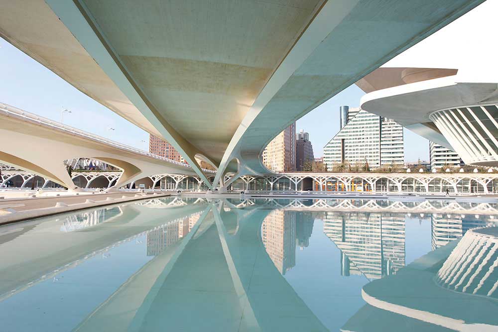
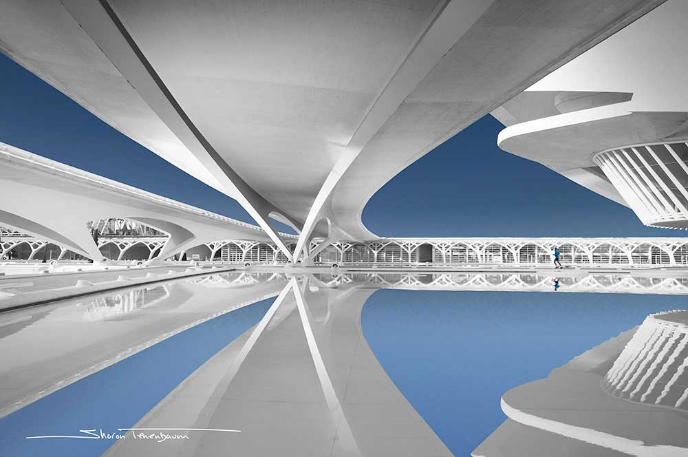
When I took this shot, in my mind’s eye, I saw the leading lines of the bridge above (with its connection to the left bridge) and how they both converged to continue together on the other side of the water. I also saw the sci-fi looking structure on the right – all this registered with the beautiful reflection. The rest, the buildings, lamp posts and foliage were not relevant to my vision. The vision of celebrating line and form.
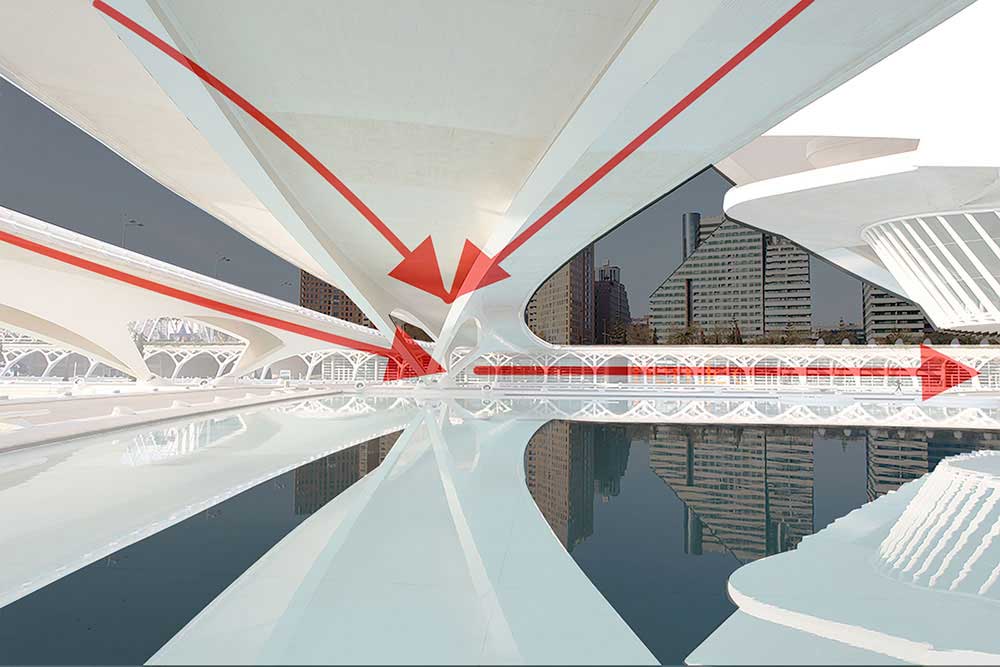
Books can be filled on the impact color has on the way we interpret a scene. I am a string believer that colors carry the power of an emotion, when we convert an image to black and white, we strip it of an emotion. For this image, I felt that the subtle light blue, aided in creating a surrounding of that sci-fi look I was after.
As Architectural Fine Art Photography is my passion it has been the subject of my images for over a decade now. My path of creating this body of work was a path of self-discovery. Even though some of my earlier architectural images are stellar and I would not have done anything different with them today, in my newer work, I am embarking on a creative shift. This shift is taking my architectural images in a different direction, so now, they are not just about celebrating form, but also about human interaction with the architectural environment.
Architectural structures, by their nature, are designed to serve a propose used by people. By eliminating people out of the composition, the photographer is celebrating the art of geometry and engineering above anything else. As magnificent as the design might be, by including a human element into the composition, the image takes on a new (and different) lifeform. The benefits are three-fold:
First it adds a sense of life and warmth to an otherwise cool scene. An architectural image in its nature will be comprised of concrete, steel and / or wood. By including even a single person in the image, we are warming up the scene and crossing the boundaries from the inanimate to the animate.
Second, it gives a structure a sense of sale and conveys a closer look at the architect’s original intent in design, which is serving people for a specific purpose. Middle Age Gothic churches were designed to dwarf the scale of a human in comparison to the House of God they were entering. A church was designed to be of enormous scale to give the parishioners an ‘other worldly’ experience. If you walked into a Middle Age church and did not get that feeling then the architect did not do his job right. This was done with the intension of making one feel small in the presence of the Almighty God.
Needless to say, two images of a church, where one depicts the sense of scale by including a human reference would convey that concept whereas the image without would not.
Lastly, by adding a single person, we are giving the viewer’s eye a resting point. The psychologically reason for this I can’t say, however, it is a fact. We tend to first spot the person in the image and use the rest as a background. That makes the image more intriguing on a few levels, first, as the photographer / artist, you now have the power to direct the order and attention your viewers are looking at your work, you are saying to them: start here. Second, it helps to simplify a scene that otherwise can be too busy with lines and shapes (as in the image below). Third, and maybe most important, is that it adds asymmetry or shifts the ‘center of gravity’ of an image to create a more intriguing composition.
My greatest passion in the field of Architectural Photography is the subject matter of Bridges. I always found them to be the greatest engineering marvels, and every once in a while, they are actually beautifully designed as well! My Bridges Portfolio is a lifelong project, evolving in complexity in conjunction with me.
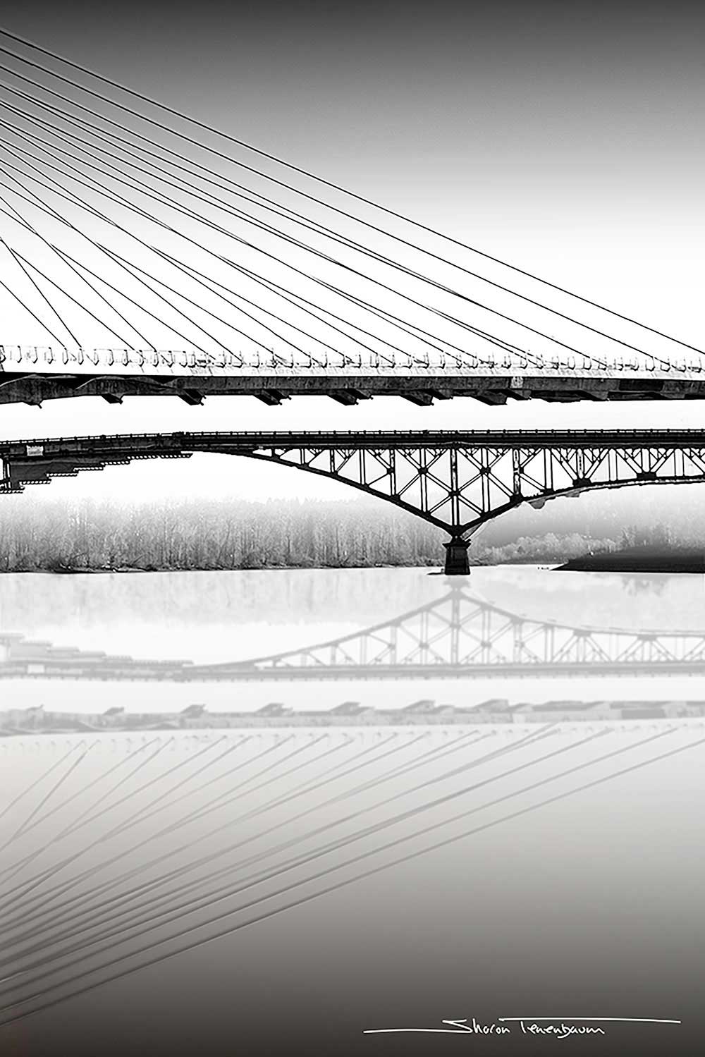
I use the same guidelines I discussed earlier when implementing my bridge images as there as well, a celebration of lines and form. I was recently in Portland OR, a wonderland for bridge lovers as the city is parted by the Columbia river with a series of bridges connecting one side to the other. From modern sleek to old iron trestle bridges, Portland has them all!
I chose to accentuate the modern clean lines by juxtaposing them with the iron trestle bridge below. The cropped composition was just enough to create an abstract feel without losing context.
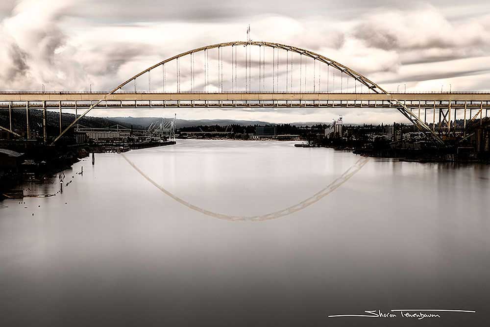
One way to eliminate unnecessarily details in the image, such as distinct cloud formations or water ripples is to shoot a Long Exposure image. The long exposure technique works as two-fold. First as I mentioned, it eliminates irrelevant details that don’t add to the story you are telling. Second, a long exposure image creates a ‘soft’ feel to an image, it smoothens out details. This smoothness, counters the strong and stable impression we have from a bridge. A stable structure promising safe passage between two seemingly unpassable locations.
Notice in the image below how ripples were eliminated (due to a long exposure capture). Even-though this was a long exposure image, the clouds retained details as they weren’t moving all that much. This eventually added to the drama and impression of strength it gave the bridge, standing strong and withstanding the elements. As described above, the soft long exposure water created a nice juxtaposition to the strong bridge and impending sky.
Sharon Tenenbaum teaches Fine Art Architectural Photography Workshops around the world. Her 2018 workshop itinerary includes Portland Bridges Workshop and NY Urban Fine Art Architecture.
To learn more about Sharon’s work and details about her upcoming workshops, please visit: SharonTenenbaum.com
Sharon Tenenbaum
Sharon Tenenbaum is a multiple international award winning fine art photographer. Sharon was educated as a Civil Engineer and practiced as a Professional Engineer in Vancouver Canada. In late 2007, she made a decision to part from engineering in order to pursue her passion for photography. Sharon’s creative voice has a distinctive style in which she combines her scientific and artistic side in creating exceptional Architectural Photography Portfolio. Sharon shares her passion by teaching fine art photography workshops around the world as well as at Langara College and Simon Fraser University in Vancouver, BC.


